Amex Gadget Insurance
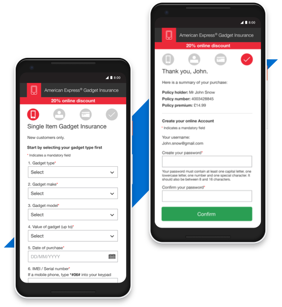
The project objective was to increase the customer subscriptions through the website. It was decided to review and improve the UX and UI of the enrolment customer journey in order to make it more effective for new users. Upon replenishment of the web pages, an increase of ~10% enrolment through the website was registered.
Audience
New customers
Timeline
2 weeks
Involvement
Working together with the marketing team focusing on how to reduce page noise and clutter, simplify and reorder information in order to reduce cognitive load and form interaction. The UI was also reviewed to better fit mobile devices with small screen. The typography was adapted and the usable field improved. Several solutions were prototyped and tested.

Activities
Information gathering, visual research, UI design user flows and creation of a modular visual system, content integration with marketing, branding execution, UI testing and validation.
Tools & Software
- Adobe XD
- Illustrator
- Sublime Text